Westpac Logo History
Westpac’s red “W” is one of the most enduring marks in Australian banking, and one of the more unusual stories behind it, is…

Explore expert logo design tips, branding ideas and practical insights for Australian businesses. Learn about logo design, brand identity, visual branding, logo file formats, rebranding and creating a professional brand that stands out.
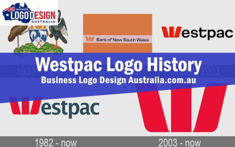
Westpac’s red “W” is one of the most enduring marks in Australian banking, and one of the more unusual stories behind it, is…

NAB’s branding is a good example of a bank that found a simple, distinctive symbol early on and has stuck with it ever…

Woolworths is one of the most recognisable brands in Australian retail, and its green “W” icon is a big part of that. What’s…

The yellow and black diamond is one of the most recognisable marks in Australian banking, so ingrained in everyday life that it’s become…

Coles has been part of Australian retail for over a century, and its logo has changed more times than most people would guess,…

Cochlear’s branding story is different to most of the businesses covered so far. Rather than a series of dramatic redesigns, its identity has…

Bunnings is a good example of a brand where the logo itself has stayed relatively simple and stable, while the cultural meaning attached…

BHP’s branding history is a genuinely global story, shaped by a merger with a South African mining company, a slow decade long process…

Few logos in Australia are as instantly recognisable as the red Australia Post emblem. It’s been through several redesigns since the organisation’s formation,…