
Woolworths is one of the most recognisable brands in Australian retail, and its green “W” icon is a big part of that. What’s less well known is the story behind that icon, including a genuinely surprising trademark dispute with one of the world’s biggest tech companies.
Early Days and “The Fresh Food People”
Woolworths traces its origins back to 5 December 1924, when founders Percy Christmas, Stanley Chatterton and their partners opened the Woolworths Stupendous Bargain Basement store in Sydney’s Imperial Arcade. The name itself needed a trademark check at the time, to confirm it wouldn’t conflict with the unrelated American F.W. Woolworth chain.
By the mid 1980s, Woolworths was losing ground to competitor Coles, with falling profits through 1986 and 1987. In response, the business launched “The Fresh Food People” campaign in 1987, created by advertising agency Leo Burnett, deliberately shifting the brand’s focus toward fresh produce rather than competing purely on price the way Coles had been. The wordmark that accompanied this campaign, created by Dupree Design Group, stayed in use for 21 years, from 1987 through to 2008.
The Green Apple Icon
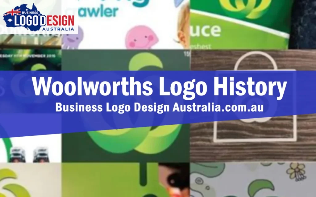
In 2008, Woolworths replaced that long standing mark with a new design from Hans Hulsbosch of Hulsbosch Communications, introducing the green icon built around a stylised “W” that’s still in use today. Look closely and the shape reads as two overlapping green apples, a deliberate nod to fresh produce and health that ties directly back to the “Fresh Food People” positioning the brand had built over the previous two decades.
The Woolworths icon works for a few clear reasons: it directly communicates the fresh food positioning, its organic shape reads as shorthand for the brand, and it has a welcoming, simple quality that’s easy to recognise at a glance. According to Hulsbosch, the reaction from Woolworths’ own marketing team on first seeing the concept was immediate and enthusiastic.
An Unexpected Trademark Dispute
Here’s where the story gets genuinely interesting. In October 2009, Apple Inc formally objected to Woolworths’ trademark application through IP Australia, arguing the apple shaped icon was too similar to Apple’s own logo. The dispute highlights something worth remembering for any business: even a genuinely original design can run into trademark conflict if it evokes something already registered in a similar space, which is exactly why checking for potential conflicts before finalising a logo matters, regardless of how distinctive a design feels.
A Rebrand That Paid Off
However the trademark question played out, the rebrand itself was widely considered a commercial success. Woolworths’ brand awareness reached an all time high following the launch, with the identity now recognising well over a thousand stores across Australia and New Zealand. Quarterly sales reportedly jumped 6.5 percent to more than $12 billion shortly after the rebrand launched, and the identity was recognised among the top rebrands in the world by international industry publications.
Minor Refinements Since
The core green “W” icon has stayed remarkably consistent since 2008. A handwritten style variant of the slogan began appearing in catalogues from late 2015, and the wordmark itself has shifted between red and green at different points. It’s worth noting that Woolworths Group’s separate corporate logo, used for the parent company rather than the supermarket brand itself, was updated again in 2022, but the supermarket’s green apple icon that most Australians recognise day to day has remained untouched.
What This Story Teaches Other Businesses
The Woolworths rebrand shows how a logo can succeed by tying directly back into a brand’s actual positioning rather than chasing a trend. The apple icon didn’t just look fresh, it visually reinforced a message the business had already spent twenty years building. It’s also a useful reminder that trademark risk isn’t only about copying something outright, sometimes a genuinely original idea still needs checking against what’s already out there.
About Business Logo Design Australia
Business Logo Design Australia designs custom logos for businesses across the country, from new startups to established businesses going through a rebrand. Every project starts with a real conversation about your business, followed by original concepts, a set number of revisions, and a complete set of final files ready for web, print, signage and everyday use. Pricing is laid out clearly before you commit to a package, so you always know what’s included.
Want a Logo That Ties Back to Your Brand’s Story?
The strongest logos, like Woolworths’ apple icon, do more than look good, they reinforce something true about the business. Business Logo Design Australia builds that connection into every logo from the first concept.