
Westpac’s red “W” is one of the most enduring marks in Australian banking, and one of the more unusual stories behind it, is that the symbol actually predates the Westpac name by about seven years. It’s also part of a broader pattern worth noticing: several of Australia’s most recognisable logos, Westpac included, trace back to the same designer.
Australia’s Oldest Bank
Westpac’s roots go back further than any other Australian bank still operating today, opening as the Bank of New South Wales on 8 April 1817, after a group of Sydney colonists met the previous November to discuss the colony’s unstable finances. Its first depositor, Sergeant Jeremiah Murphy, placed 50 pounds with the newly formed bank.
A Heraldic Beginning
The bank’s first proper logo, adopted in 1931, was a formal heraldic crest, complete with birds and a traditional ribbon carrying the wordmark beneath it, the kind of imagery that was standard for banks projecting stability and heritage at the time. The crest itself was genuinely elaborate, featuring a shield split diagonally with a sailing ship and wheat sheaves above, a lamb and sheep below, mining tools, and a golden kangaroo beneath a rising sun, alongside a Latin motto.
The Red W Arrives, Years Before Westpac Did
In 1974, the bank retired that ornate heraldic imagery in favour of something dramatically simpler and, for the era, genuinely surprising, a bold red “W”. The choice made sense given the bank’s nickname at the time: the Bank of New South Wales was commonly known as “The Wales.”
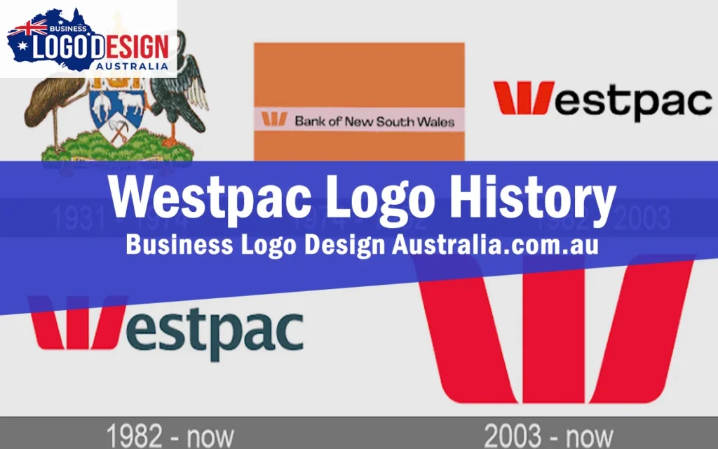
The new mark was remarkably effective. Within seven years, the “W” had achieved a brand recognition rating of over 78 percent, meaning the vast majority of people who saw it could identify it immediately. The designer behind it was Pieter Huveneers, the same designer responsible for the original Australia Post logo and Myer’s identity, both of which are also still in use today in some form. It’s a genuinely notable thread running through Australian corporate design history, one designer’s work still visible on postboxes, department stores and bank branches decades later.
From The Wales to Westpac: 1982
In 1981, with the Bank of New South Wales preparing to merge with the Commercial Bank of Australia, neither institution wanted to give up its name or history entirely, so Huveneers was brought back to develop a new name that would work for both. The result, Westpac Banking Corporation, combined “Western” and “Pacific,” reflecting the merged bank’s reach across the region, and was formally adopted in October 1982 in what was, at the time, the largest banking merger in Australian history.
Crucially, the red “W” that had already built such strong recognition wasn’t replaced for the new name, it was kept largely as is and simply paired with the new Westpac wordmark, protecting seven years of brand equity rather than starting over.
Refinements Since
A 2003 refresh introduced a tighter typographic pairing between the W mark and the wordmark, and dropped “Banking Corporation” from everyday display use. Notably, the red W itself, now well over three decades old at that point, remained unchanged, with the update focused entirely on modernising the supporting wordmark around it.
What Westpac’s Story Teaches Other Businesses
This is one of the clearest examples in Australian branding of a symbol outliving the name it was originally created for. Because the “W” had already built such strong recognition under the Bank of New South Wales, the smartest move during the 1982 merger wasn’t to design something new, it was to protect what was already working and build the new name around it. For any business going through a merger, acquisition or rename, that’s a genuinely useful principle: a strong existing symbol is often worth more than a fresh start.
About Business Logo Design Australia
Business Logo Design Australia designs custom logos for businesses across the country, from new startups to established businesses going through a rebrand. Every project starts with a real conversation about your business, followed by original concepts, a set number of revisions, and a complete set of final files ready for web, print, signage and everyday use. Pricing is laid out clearly before you commit to a package, so you always know what’s included.
Going Through a Merger or Name Change?
Westpac’s story shows how a well built symbol can survive a name change and keep building on decades of existing recognition. Business Logo Design Australia can help you work out whether your existing logo has that kind of equity worth protecting, or whether a fresh start genuinely makes more sense.