
BHP’s branding history is a genuinely global story, shaped by a merger with a South African mining company, a slow decade long process of dropping a name that had stuck around from that merger, and a return to something much closer to where the company started, a simple three letter mark.
Named After a Single Mine
BHP began in 1885, originating in the mining town of Broken Hill in outback New South Wales, focused initially on silver, lead and zinc extraction. The company took its name directly from the location, Broken Hill Proprietary Company Limited, and its early growth was tied closely to the Broken Hill mine that gave it its start. The business steadily diversified from there, moving into steelmaking with the establishment of steelworks in Newcastle in 1915.
Early Branding: Simple and Confident
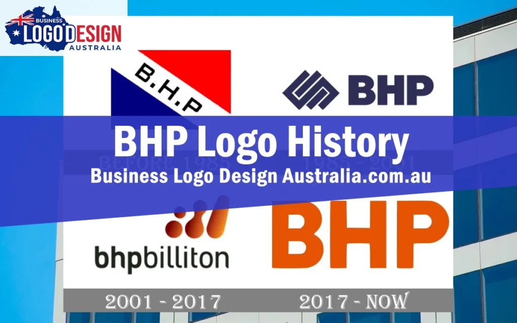
BHP’s original logo was a straightforward tricolour flag design, blue and red sections separated by a thick white diagonal banner carrying the company’s initials in bold black lettering, a simple composition that projected stability without unnecessary decoration.
The 1985 Redesign
By the mid 1980s, the company had expanded significantly into copper and oil production, prompting a rebrand to better reflect its growing scale. The new logo moved to a much more massive, sans-serif treatment of the letters “BHP,” paired with a geometric emblem built from overlapping squares and rectangles, a distinctly more modern, minimalist look than the earlier flag design.
The Billiton Merger and a New Identity
In 2001, Broken Hill Proprietary Company merged with the Anglo-South African firm Billiton, forming BHP Billiton and marking one of the more significant corporate combinations in the company’s history. The resulting logo extended the wordmark to “Bhpbilliton,” set in lowercase, paired with a graphic mark made up of three orange, gradient toned shapes, two dots merging together and a solid elongated drop, deliberately symbolising the coming together of the two companies into one.
Simplifying Back to Just “BHP”
Nearly two decades after the Billiton merger, the company began moving away from that combined naming. In May 2017, BHP introduced a new logo that dropped the merged graphic entirely in favour of simply spelling out “BHP,” alongside a new motto, “Think Big,” replacing the previous “Resourcing the Future.”
The name change became official in November 2018, when BHP Billiton Limited and BHP Billiton Plc formally became BHP Group Limited and BHP Group Plc, with stock exchange tickers across London and Johannesburg updated to simply “BHP.” The company explained the move as a deliberate refocusing on its Australian roots, timed alongside a broader restructuring that included spinning off several non-core assets into a separate company, South32, and exiting its US shale gas operations.
Why the Simplification Made Sense
Dropping “Billiton” from the name and logo wasn’t just a cosmetic choice, it reflected a genuine business shift, the company’s core assets by that point were largely the ones tied to the original BHP heritage rather than the Billiton side of the 2001 merger. The simplified “BHP” wordmark matched that reality more honestly than continuing to carry a merged name the business itself had moved on from operationally.
What BHP’s History Teaches Other Businesses
BHP’s journey from a simple flag mark, through a complex merged identity, and back to a stripped down wordmark is a useful reminder that a logo should ultimately reflect what a business actually is, not just what it once was. Holding onto a merged or legacy name in your branding long after the underlying business has moved on can create a mismatch between what a logo says and what a company does. Sometimes the right move isn’t a bold new direction, it’s simplifying back toward what’s genuinely true about the business.
About Business Logo Design Australia
Business Logo Design Australia designs custom logos for businesses across the country, from new startups to established businesses going through a rebrand. Every project starts with a real conversation about your business, followed by original concepts, a set number of revisions, and a complete set of final files ready for web, print, signage and everyday use. Pricing is laid out clearly before you commit to a package, so you always know what’s included.
Does Your Logo Still Match Your Business?
If your business has grown, merged, or shifted focus since your logo was first designed, it might be carrying visual baggage that no longer fits, the same problem BHP eventually solved by simplifying back to its core name. Business Logo Design Australia can help you work out whether a refresh or a full rebrand makes more sense for where your business is now.